

Charity, Health, Education, IE News
'Best visual identity in health' award for Sexwise
IE Brand has been shortlisted for two pan-European branding awards. The new visual identity for sexual health campaign Sexwise – with charity client FPA – has been nominated as the best in the Health category. Our work on the new AgriFood Training Partnership (AFTP) visual identity has also picked up a nod for the equivalent award in Farming and Agriculture.
Two visual identities shortlisted for prestigious European branding awards
Here at IE Brand we’re thrilled to be shortlisted for two categories at the Transform Awards Europe 2019:
- Best Visual Identity from the Healthcare and Pharmaceuticals Sector – for Sexwise, the sexual health charity FPA’s campaign brand.
- Best Visual Identity from the Farming and Agriculture Sector – for the AgriFood Training Partnership (AFTP) with the University of Nottingham.
What's notable about both of these is that IE was responsible for not just the brand and visual identity, but also for bringing them to life with a new website too. That means it was very much a team effort across the whole of IE, involving brand and digital consultants, brand designers, copywriters, developers and project management. The success of these two brand identities is testament to the expertise of our team: brand designers who understand digital, and a digital team who understand the importance of visual identity design.
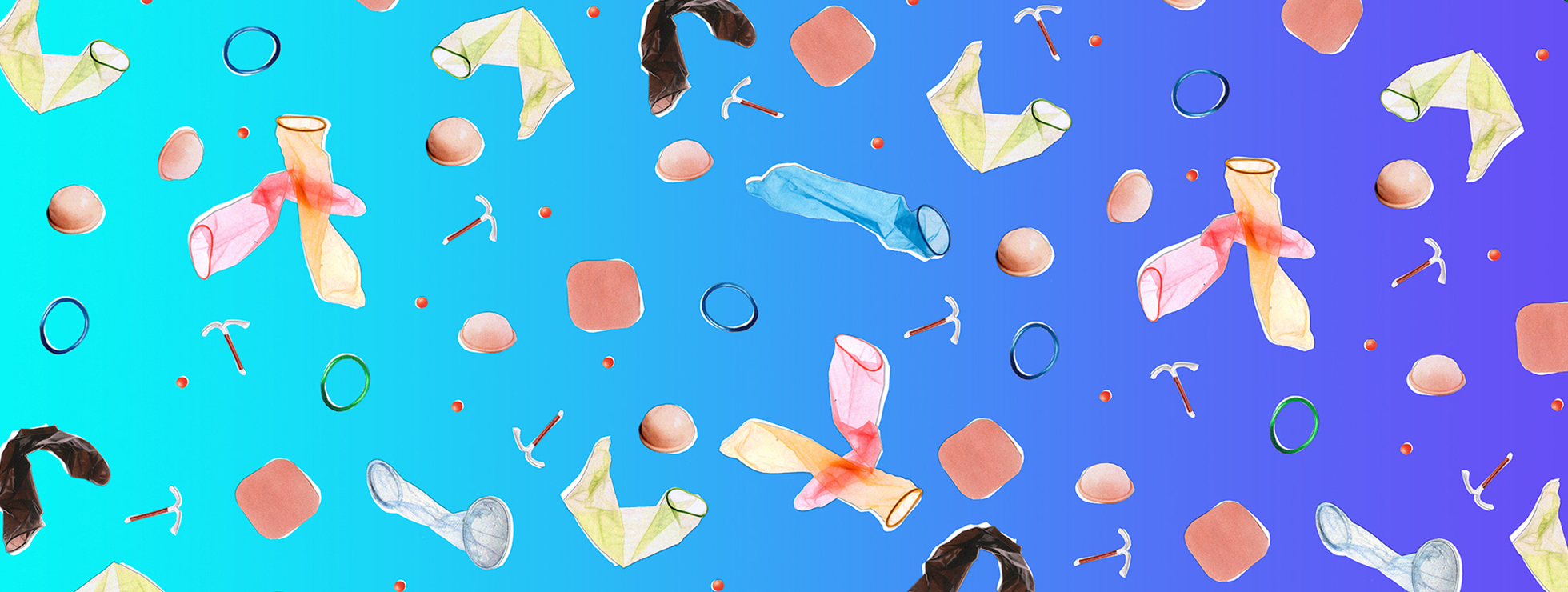
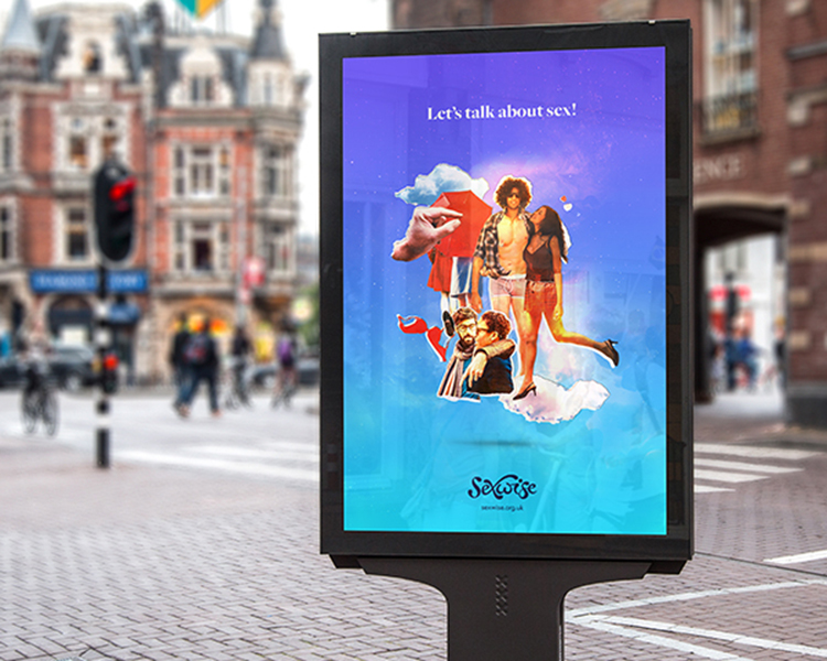
Bold, bright visual identity for new sexual health campaign
The FPA (Family Planning Association) had ambitious plans to create the UK’s leading brand for information and support on how to enjoy a safe and satisfying sex life. Stakeholder research showed that FPA’s existing brand didn’t match the image they wanted to convey. Their target audience is very broad – people of reproductive age (around 16-50), parents, and people with learning disabilities. FPA needed a more approachable campaign brand and website, aimed at combatting the minefield of unreliable information on the internet, and driving measurable improvements to public sexual health and wellbeing.
Stakeholder research showed that the campaign needed to be bold and brave, with a friendly, approachable, inclusive tone. The result is Sexwise: a sex positive, inclusive brand and visual identity that looks and sounds vastly different to a typical sexual health brand.
Highly credible health brand and visual identity
The final visual identity and messaging can be dialled up to portray a feeling of euphoria, energy and ecstasy, or dialled down when addressing the more serious side of sexual health.
The brand translates comfortably across print and screen, to accommodate a range of uses. Online, the brand is shown to best effect on mobile devices.
Sexwise is a highly credible brand, and the website receives traffic from over 500 external sources including numerous NHS and health organisations, and charities. They received a mention on BBC Radio Four’s Woman’s Hour programme. The brand also enabled FPA to partner with PHE on their “Protect Against STIs” campaign. After only a year, the website receives c.100,000 users per month, and growing.
Check out the Sexwise website.
A single brand and visual identity unites six university partners
For the AgriFood Training Partnership, IE Brand took three previous brands and combined them into one. Combining six UK universities who lead the way in agrifood research, the new brand needed to be seen as an industry heavyweight, appealing to training participants, employers in the Agrifood industry, academics, and government regulatory bodies.
New logo and visual identity
Stakeholder research told us the key was for the AFTP to look, sound and behave like an agrifood industry brand, rather than an academic/university brand. IE created a new logo and visual identity that is firmly rooted in the world of agrifood, not the classroom, to celebrate the best the industry has to offer.
The visual identity combines strong icon graphics with photography showing people working in industry and the textures of agrifood. The colour palette bucks the trend for the sector, using bright colours instead of more typical greens.
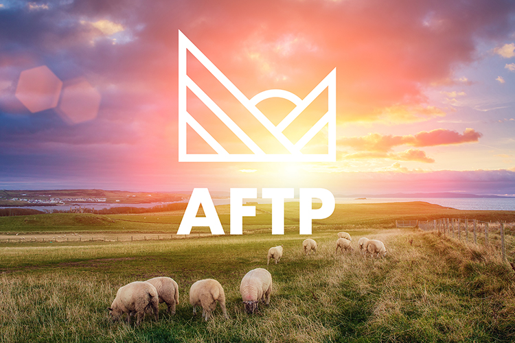
The result is an authoritative visual identity that conveys the passion of the people in the sector, and positions the AFTP as a market leader. It's a distinctive, impactful brand to take the AFTP forward and establish the partnership as an industry heavyweight. The brand is now positioned to have commercial appeal with industry/employers, as a sought-after accreditation and a mark of quality and staff development.
The AFTP website has also received a W3 silver award, recognising its outstanding design and user experience.
Of course, we've had considerable success at the Transform Awards in the past, including picking up three Golds. But as Transform told us it has been a record year for entries, with the judging process lasting four full days to get through the huge number of submissions, we're all the prouder to be on the shortlist again this year. Keeping our fingers crossed for March!
2019, the tenth anniversary of the Transform Awards, has been a record year for submissions. The judging was extremely thorough so this year has been very competitive. It is absolutely fantastic to see IE once more reach the shortlist. Massive congratulations.
Andrew Thomas, Publisher
Transform magazine
