Brand Clients

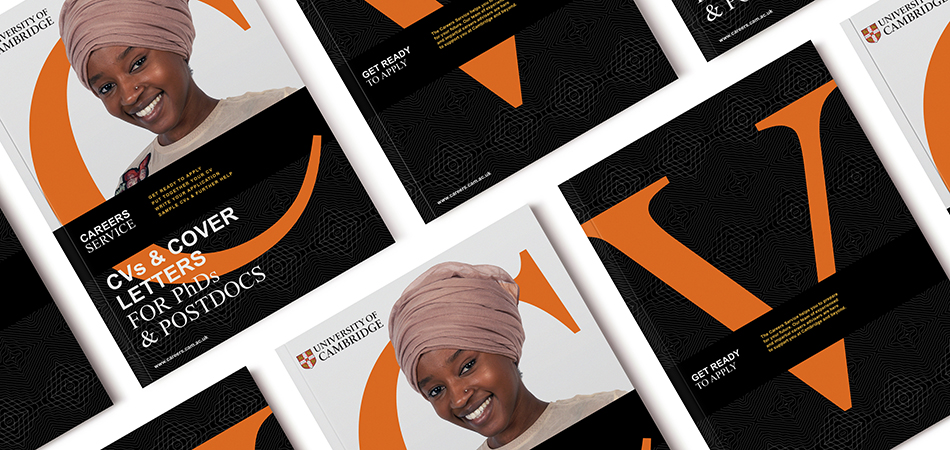
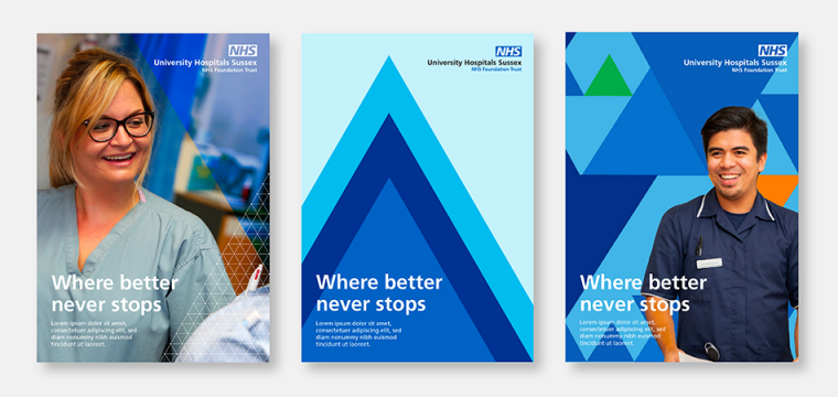
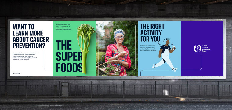
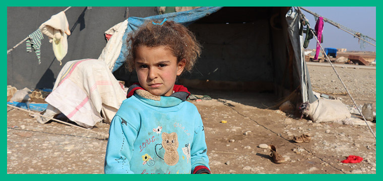
IE Brand works with charity, health and education clients up and down the UK, as well as internationally. Sometimes we work for large charities and universities that are household names, and sometimes we help small health and social care providers, colleges, or charity startups with big ambitions. If you’re a values-driven organisation with a challenge, then we’d love to add you to our list of clients!

Off
  • University of Cambridge logo/crest (grey)
    University of Cambridge logo/crest

    University of Cambridge careers service brand on key publications

    The University of Cambridge is one of the world’s top five universities. The Careers Service helps Cambridge Undergrads, Postgrads and Postdocs to prepare for their future. 

    Explore how we rebranded the University of Cambridge's careers service.

    What a journey it has been! We asked IE Brand to disrupt us, which they did by getting us to listen to our students and embrace the student voice in our comms. We knew the process would be painful for Cambridge at first, but we now embrace this disruption and actively seek more of it.

    Thanks to the consultants at IE Brand we’ve been able to change perceptions of the Careers Service, simplify our offering, and significantly drive up student engagement at events and on social media. Our comms now stand out with a consistent new visual identity, and we feel more confident in what we are doing. Thank you!

    Amanda Norman
    Careers Adviser & Rebrand Project Manager, University of Cambridge
    Close Get in touch Get in touch Get in touch
  • World Book Day logo on a grey tag, with eyes looking down and to the left inside the double O of book. Shows the date, 2 March 2023
    World Book Day logo on a yellow tag, with eyes looking down and to the left inside the double O of book. Shows the date, 2 March 2023

    World book day banner showing the date 2 March 2023 and the WBD logo, with illustrations by Allen Fatimaharan

    IE Brand & Digital provided intense design and development support for the rollout of World Book Day 2023. Read more on the IE blog.


    From our reading for pleasure resources for teachers and families, to the £1/€1.50 book tokens that we give to every child in the UK and Ireland, to our digital adverts, IE helped us to sprinkle World Book Day magic on our campaign assets and website.

    Emma Pritchard
    Manager, World Book Day
    Close Get in touch Get in touch Get in touch
  • University Hospitals Sussex NHS Foundation Trust logo in grey
    University Hospitals Sussex NHS Foundation Trust logo

    Mockup showing three styles of booklets/brochures using the new University Hospitals Sussex visual identity. The title 'Where better never stops" is backed by striking visuals based on triangular forms in shades of NHS blue, with accents of orange and green. Created for the NHS by IE Brand.

    A new brand and visual identity for the newly merged University Hospitals Sussex NHS Foundation Trust.

    The trust was formed on 1 April 2021 from the merger of Brighton & Sussex University Hospitals NHS Trust and Western Sussex Hospitals NHS Foundation Trust. The new trust runs 7 hospitals in Brighton, Chichester, Haywards Heath, Shoreham-by-Sea, and Worthing. 

    View the full UHSussex case study

    We were very impressed by the speed at which IE Brand was able to gain an insightful understanding of the distinct cultures of the two merging Trusts, and delighted by the strength and clarity of their recommendations. Their team worked at extraordinary pace to meet our tight deadlines, whilst always taking great care to listen, explain their thinking, and ensure they took us with them along the journey.

    Jonathan Keeble
    Director of Communications and Engagement, UHSussex
    Close Get in touch Get in touch Get in touch
  • new Royal Academy of Engineering logo by IE Brand
    new Royal Academy of Engineering logo by IE Brand

    Royal Academy of Engineering brand with duotone photography in vibrant colours

    IE Brand rebranded the Royal Academy of Engineering, beginning with a new tone of voice and brand messaging to encapsulate their new five-year plan. We then set about creating a modern, intriguing new visual identity and logo design.

    Read the full rebranding case study

    Previously, IE worked with the Academy to create a new name, logo, brand messaging and visual identity for a sub-brand: Engineering X. This is an exciting new international collaboration founded by the Royal Academy of Engineering and Lloyd’s Register Foundation (LRF). They wanted to bring together some of the world’s leading problem solvers, united in a common aim to identify and solve the great challenges of our age. 

    IE Brand provided invaluable support... I was impressed by how quickly they were able to grapple with and unpick our complexity, and understand the needs of our many different stakeholder groups. They were collaborative, not afraid to challenge, and eminently professional throughout. Importantly, as a client, I felt IE Brand understood and were sensitive to the challenges of facilitating such a process in-house, and as invested in delivering a good outcome as we were. Highly recommended!

    Jo Trigg
    Director, Communications and Engagement, Royal Academy of Engineering
    Close Get in touch Get in touch Get in touch
  • Bowel Research UK logo in grey, by IE Brand
    Bowel Research UK logo by IE Brand

    Brand photography for Bowel Research UK featuring families having fun at the park

    Born from the merger of two Bowel Research charities – Bowel Disease Research Foundation and Bowel & Cancer Research – Bowel Research UK is committed to radically changing the outlook for people living with bowel disease, through vital patient-centred research.

    IE worked with the charity throughout the process of stakeholder research, renaming and rebranding. The result is a bigger, stronger, united brand identity dedicated to ending bowel cancer and bowel disease. A new WordPress site provides a home for funding applications, donations, and information on bowel cancer and bowel disease.  

    Read the full renaming and rebranding case study for merged charity Bowel Research UK. 

    IE Brand has helped us to navigate the landscape of rebranding our charity. What has impressed me most is the continuity of care. From the bidding process to the reality of working with IE, there is absolutely no difference – IE make us feel like we are their top priority client. They are clearly very knowledgeable and skilful, and this comes through at every stage. They are undoubtedly bringing out the best in our charity and involving us at every step. They have helped us to negotiate some challenging internal conversations, providing support and options at every turn.

    Kathryn Pretzel-Shiels
    Board Member & Chair of Fundraising & Communications Committee
    Close Get in touch Get in touch Get in touch
  • Community Pharmacy England logo in grey
    Community Pharmacy England logo in Forest Green, Magenta and Lilac

    Community Pharmacy England poster designs

    Pharmaceutical Services Negotiating Committee (PSNC) was the representative body for all community pharmacy owners in England. They had decided to rename to Community Pharmacy England, and needed a wider brand repositioning, messaging and visual identity to support their influencing work and reach a wider audience.

    Community Pharmacy England needed to be seen to be fighting for community pharmacy owners, and IE's rebrand brought them closer to the audience they represent.

    Doing this rebrand so professionally and collaboratively, and also remaining focused on the reasons for it, has really paid off so thank you to you and all the team for getting us here. Likewise we have enjoyed working with you all and are delighted with the results.

    Zoe Long
    Director of Communications, Corporate and Public Affairs
    Close Get in touch Get in touch Get in touch
  • Queen Mary University of London logo (in grey)
    Queen Mary University of London logo

    Queen Mary University of London

    Queen Mary University of London (QMUL) is one of the UK’s leading universities. With over 23k students, from 160 nationalities, they are known for their international collaborations in teaching and research.

    QMUL was the best kept secret in the Russell Group. They wanted to drive applications through the annual UCAS process, with one of their largest ever campaigns across outdoor media and a host of digital channels.

    IE Brand delivered a bright, bold and impactful creative concept, putting students front and centre, and emphasising the university’s Diversity focus. We supplied over 50 pieces of artwork and animation, from 90-pixel gifs to bus-sides and 96-sheet billboards.

    Read more about the QMUL student recruitment campaign

    It’s not easy working on a project with challenging deadlines and multiple agencies. The whole team at IE made this process seamless for us. They developed a strong creative, managed the project and provided feedback and recommendations. Our experience with IE has been very positive with an easy and professional working relationship that has made the project a pleasure. Thank you IE. We look forward to working with you again.

    Negin Parvizi
    Head of UK Student Recruitment Queen Mary University of London
    Close Get in touch Get in touch Get in touch
  • British Psychological Society logo
    British Psychological Society logo

    Campaign image for the British Psychological Society's 'Cyber Psychology Network'

    The British Psychological Society acts as the representative body for psychology and psychologists in the UK. The charity is responsible for the promotion of excellence and ethical practice in the science, education, and application of the discipline. They support and enhance the development and application of psychology for the greater public good, setting high standards for research, education, and knowledge, and disseminating our knowledge to increase public awareness.

    IE has worked with the British Psychological Society on a number of campaigns and top-level consultancy projects. These include a comprehensive brand and digital audit, and a range of consultancy and campaign projects to explore the Society's membership offerings, as well building an online tool to help BPS members to navigate specialist member networks.

  • L'Arche logo in grey - icon represents three people in a small boat
    L'Arche logo in blue - icon represents three people in a small boat

    A young volunteer assistant dancing with a L'Arche member

    L’Arche is building a world where people with and without intellectual disabilities are friends and equals. Their diverse global community has been living together, working together, and learning from one another, for nearly sixty years.

    The charity needed a rebrand and a new website, and IE was only too happy to help. 

    Visit larche.org

    Working across multiple languages, cultures and contexts, IE approached our challenges with sensitivity, skill, and insight: to help us re-articulate our core proposition.
    The resulting messaging and visual identity have helped to increase unity internationally and will allow us to harness the combined power of our global brand for the first time.
    They have also been extremely supportive, helpful and easy to work with!

    Heather Coogan
    Director of Public Engagement
    Close Get in touch Get in touch Get in touch
  • FPA Family Planning Association logo in grey
    FPA Family Planning Association logo

    Sexwise: Sexual health campaign brand for FPA

    The FPA needed an intriguing, witty brand and website to deliver straightforward information and support on sexual health, sex and relationships to everyone in the UK.

    Read how IE created the new Sexwise brand

    We needed an agency to help us develop a sex-positive, digital-first new brand to get health information to the public. At the pitch, IE impressed us with their expertise, agile approach to digital and enthusiasm for the project.

    The brand has to appeal to a broad audience of 16-50 year olds as well as health professionals, so audience involvement right from the start was essential. IE delivered a comprehensive research piece which led to clear recommendations on brand positioning, messaging and tone, which were then tested out in workshops. We're delighted with the bright, confident new visual identity that emerged and brand messaging that's bold, brave and never too dry or clinical.

    We enjoyed working with the IE team and we're really delighted with the end result.

    Bekki Burbidge
    Deputy Chief Executive, FPA
    Close Get in touch Get in touch Get in touch
  • Young Enterprise logo - YE in grey
    Young Enterprise logo - YE

    pfeg brand illustration of children in sports kit receiving medals

    Brand and Digital for pfeg (since rebranded Young Money), the UK’s leading financial education charity and part of Young Enterprise.

    Explore our brand work with pfeg / Young Money. 

    IE’s approach is great. They’re a bunch of really lovely, fiercely bright, creative experts who bring top quality biscuits to meetings! They’re excellent at delivery and – really unusually – they actually understand organisational strategy. They’ve taken great care of pfeg and it feels like everything they put their hands to exceeds our ever-growing expectations.

    Michaela Kirksop-Holdford
    Programmes and Services Delivery Director, pfeg
    Close Get in touch Get in touch Get in touch
  • Bank Workers Charity new logo in plum. The name is partly enclosed in a speech bubble shape
    Bank Workers Charity new logo in plum. The name is partly enclosed in a speech bubble shape

    A selection of branded posters for Bank Workers Charity. Messages like "I've been retired from banking for 5 years... I've never felt so lonely" and the words "We're here to help" in the style of a circular stamp.

    A new brand for the Bank Workers Charity, built around their people and their community. The charity has been supporting the banking community since 1883. Each year they help thousands of current and former bank employees and their families, providing information, advice, expert support services and in some cases financial assistance.

    The new brand uses people's stories and experiences to encourage others to ask for help and start a conversation.

    The rich visual identity includes various elements that can be combined in myriad ways. Stamps, symbols, commissioned illustrations and framed photography bring comms to life, with a bold and bright colour palette. 

     
  • Langley Trust logo in grey
    New Langley Trust logo by IE Brand

    Billboard poster mock up for Langley Trust featuring a man in a garden with his back to the camera. The main headline says "Time for a fresh start" and there's a statistic that 39% of released prisoners reoffend due to a lack of opportunities and support. Providing a safe and nurturing environment for them can make all the difference.

    Langley Trust is a Christian charity that helps people with convictions to transform their lives. They believe everyone deserves another chance.

    Across the UK, they support prison-leavers, promoting rehabilitation and reducing the risks of re-offending.

    They tasked IE Brand with supporting them through a rename and rebrand project, to reflect the exceptional organisation they are. The rebrand and a new WordPress website launched in September 2023 alongside Langley's 65th anniversary celebrations.

    Read the full Langley Trust case study

    IE have been a creative joy to work with. From start to end they were clear about their processes and methodology, we had fun working together despite pretty much all of this being online. We are delighted at the results, a new brand, brand guidelines, messaging matrix and a website. Everything came in on time and to budget. Despite a significant staff change at our end and Langley being a dispersed organisation, IE worked with our project leaders professionally, calmly and with the creative energy we had hoped for. Thanks IE it’s been a blast!

    Rev Andy Rider
    Director of Chaplaincy Services
    Close Get in touch Get in touch Get in touch
  • Christian Aid logo (grey)
    Christian Aid logo

    Children smiling and waving

    Prior to investing a significant sum in a national campaign to raise brand awareness in the UK and Ireland, Christian Aid commissioned IE to undertake a brand audit and a top-level response to the proposed campaign strategy. 

    The work was effectively a high level 'sense check' in order to ensure that this household name, £100m+ charity was as well prepared as possible to optimise the impact of an omni channel, above and below the line marketing campaign to drive up awareness of the critically important work of the charity.

    IE delivered a succinct and astute evaluation of the challenges facing our brand. They clearly have a passion for their work, combined with a really helpful mix of charity and wider market knowledge.

    Claire Aston
    Head of Strategic Communications, Christian Aid
    Close Get in touch Get in touch Get in touch
  • Resuscitation Council UK new logo (grey)
    Resuscitation Council UK new logo

    New Resuscitation Council UK branding shown on a mock billboard to promote the annual Restart a Heart Day

    Resuscitation Council UK is working towards a day when everyone in society has the skills they need to save a life.

    IE Digital rebranded the charity to become more public-facing, winning Bronze at the Transform Awards 2021 for "Best Visual Identity from Healthcare and Pharmaceuticals". We also built their user-friendly new Drupal 8 website, to provide an intuitive user experience for healthcare professionals and the public alike.

    Explore how we rebranded Resuscitation Council UK. 


    Working in partnership with IE, we’ve been able to develop a new brand and website which really capture the ‘look and feel’ of who we want to be as an organisation. Visually, it looks great. The tone is welcoming and accessible, while maintaining the understated authority and clinical credibility which remain key to our reputation.

    An aged and clunky website has been replaced by one which is intuitive, user-friendly and accessible. IE has played a key role in driving our digital transformation, increasing our ability to engage and influence expert and public audiences alike.

    James Cant
    Chief Executive
    Close Get in touch Get in touch Get in touch
  • Teach First logo in grey
    Teach First logo

    Young girl as an astronaut – Teach First "Challenge the Impossible" campaign by IE Brand

    Teach First is a charity working towards the day when no child’s educational success is limited by their socioeconomic background. IE Brand was appointed to create a campaign to tackle educational equality, kicking off a year of action, campaigning and mobilisation. The campaign needed to resonate emotionally – with anger at the injustice faced by children from poorer backgrounds, as well as a positive vision for change. 

    Explore the full case study for the "Challenge the Impossible" campaign.

    The external perspective IE Brand brought to the project enabled us to step outside of our comfort zone and deliver an exciting and creative campaign identity that packs a punch. The conviction that IE have in their creative ideas is commendable and this really helped drive the project forward when obstacles were met. Feedback from internal stakeholders and our wider network of alumni and partners has been positive.

    Hayley Orrell
    Brand & Marketing Officer - External Relations Division, Teach First
    Close Get in touch Get in touch Get in touch